
Helping Westpac stand out
Westpac, traditionally seen as one of New Zealand’s more conservative banks, challenged us to elevate their most important customer communications – cutting through the usual sea of uninspiring service mail.
Working within established brand guidelines, we pushed the boundaries of what a direct mailer could be. The result was a series of pieces that felt engaging and visually distinctive, while still delivering information with clarity and intent.
Collaborating closely with copywriters, I crafted layouts that balanced readability with just the right level of detail. Each design carefully stretched Westpac’s visual language without losing the familiarity and trust inherent to the brand.
The final outcome struck that balance – unmistakably Westpac, but with a renewed sense of energy that resonated with both the client and their audience.
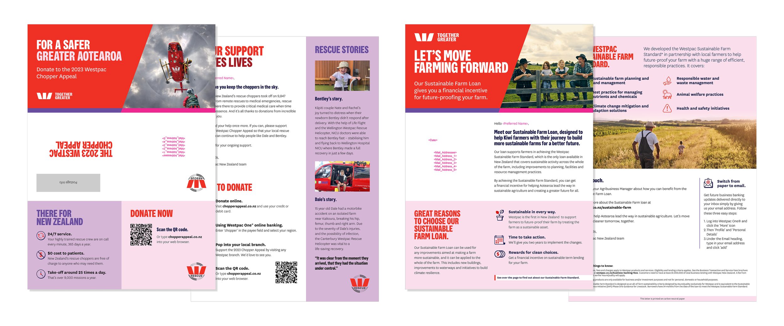
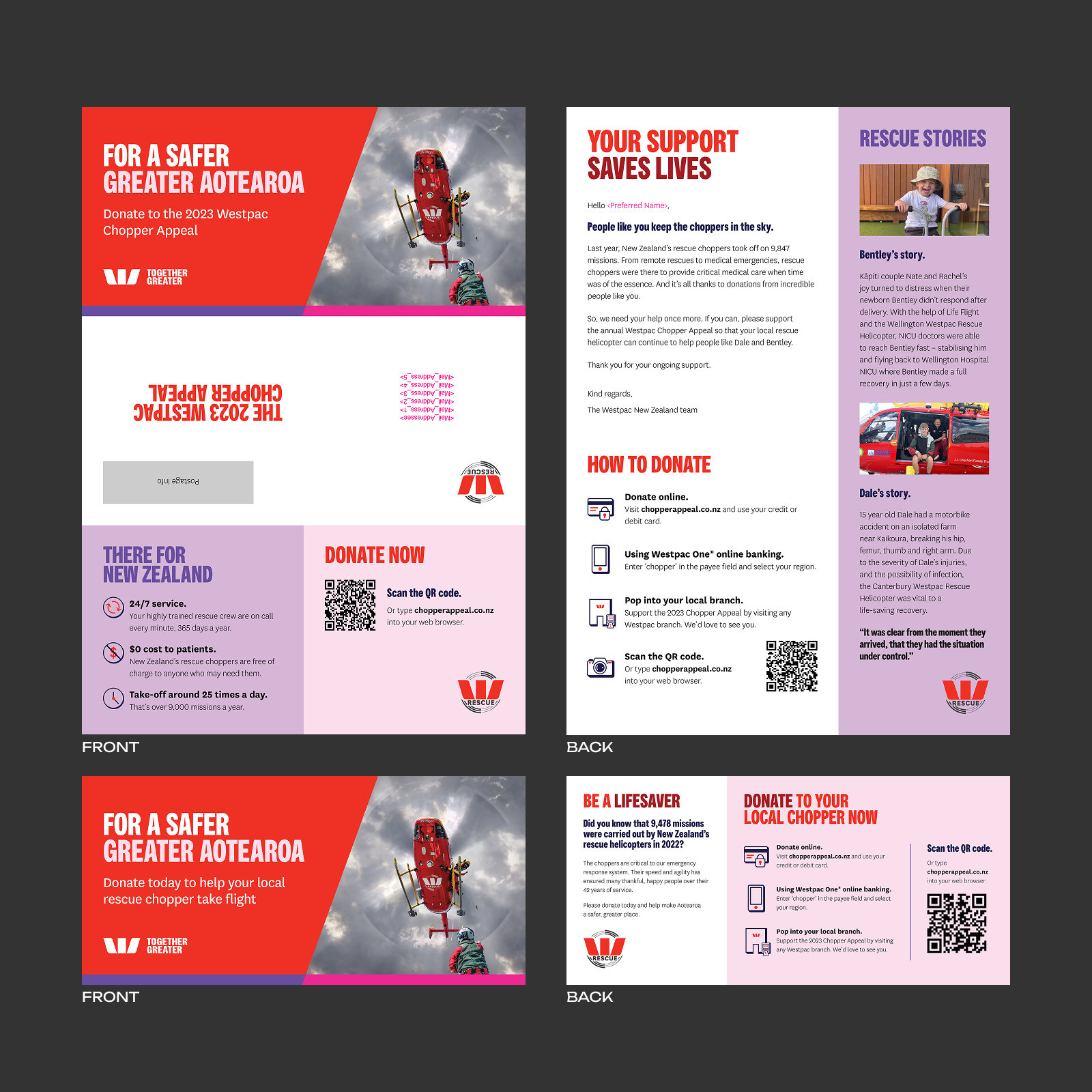
Chopper Appeal mailer
Westpac has long supported rescue helicopter services across New Zealand, with the annual Chopper Appeal a key moment in their marketing calendar – and a major driver of community fundraising.
In 2023, we were tasked with creating a direct mailer and flyer to reach both new and existing donors nationwide, with the goal of increasing awareness and driving contributions.
I developed a series of communications that felt distinctly Westpac, while using bold, attention-grabbing design to set it apart. Real rescue stories and carefully crafted messaging helped highlight the impact and importance of the service, creating a strong emotional connection with readers.
To support conversion, we made donating as seamless as possible – offering multiple pathways, from in-branch giving to quick and easy QR code donations.
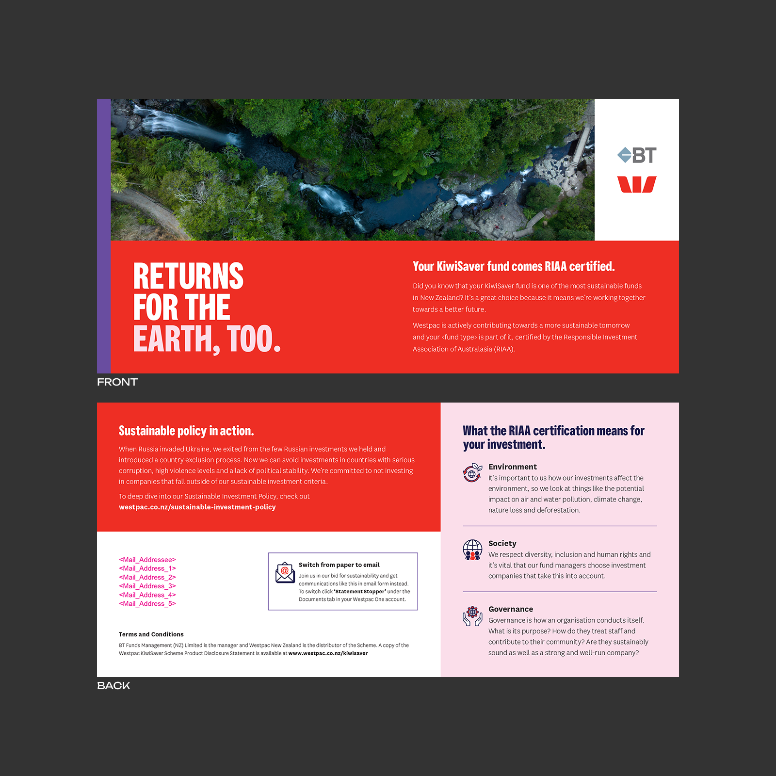
KiwiSaver Sustainability flyer
Amid growing global uncertainty, Westpac saw an opportunity to highlight the strength of their KiwiSaver offering – particularly its commitment to responsible, sustainable investment. Having recently achieved RIAA certification, they wanted to clearly communicate what this meant for their customers.
I designed a flyer that balanced visual impact with clarity, breaking down the certification across environmental, social and governance factors. The design combined distinctly New Zealand photography with bold use of Westpac’s red, ensuring the work felt both local and attention-grabbing.
Alongside reinforcing Westpac’s sustainability credentials, we also encouraged customers to reduce their own impact – prompting a shift from paper communications to digital where possible.
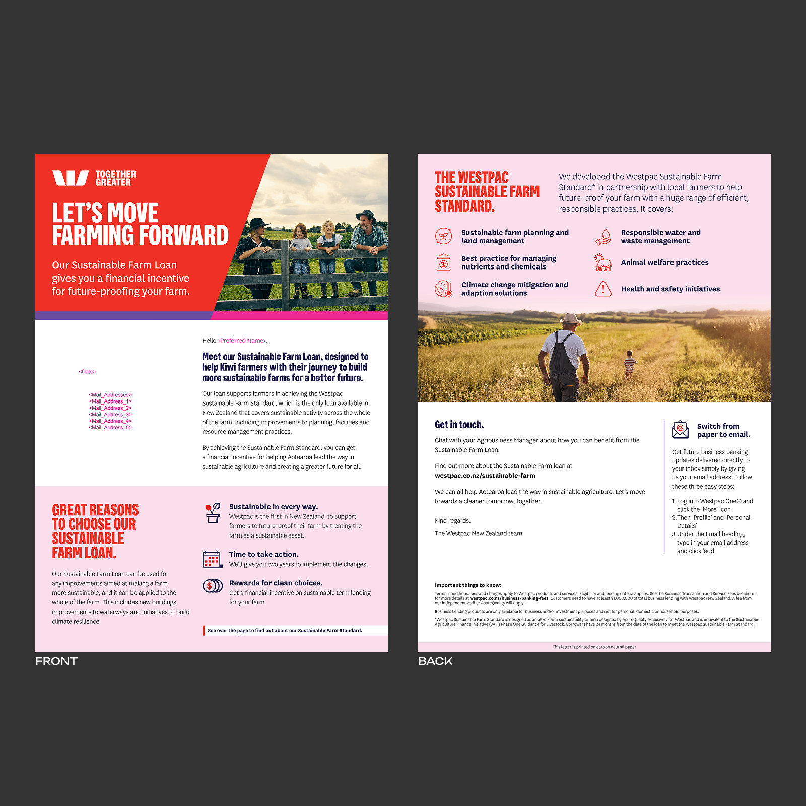
Sustainable Farm Loan mailer
As sustainability became an increasing focus across New Zealand’s agricultural sector, Westpac’s business team introduced a Sustainable Farm Loan – offering financial incentives for farmers meeting their Sustainable Farm Standard.
I designed a direct mail piece that used bold photography and clear iconography to communicate the offer with impact. A considered gradient treatment allowed imagery, text and icons to blend seamlessly, while Westpac’s bold typefaces and signature pink and red ensured the design stood out in the mailbox.
To reinforce the message, we encouraged customers to reduce their own footprint by switching off printed communications, while also highlighting that the mailer itself was produced on carbon neutral paper.