
Introducing Z Rewards
In 2024, Flybuys shut down, leaving many businesses without a loyalty programme. Z Energy used this as an opportunity to build Z Rewards – an all new programme that gives them greater control over loyalty, while offering more meaningful rewards back to their customers.
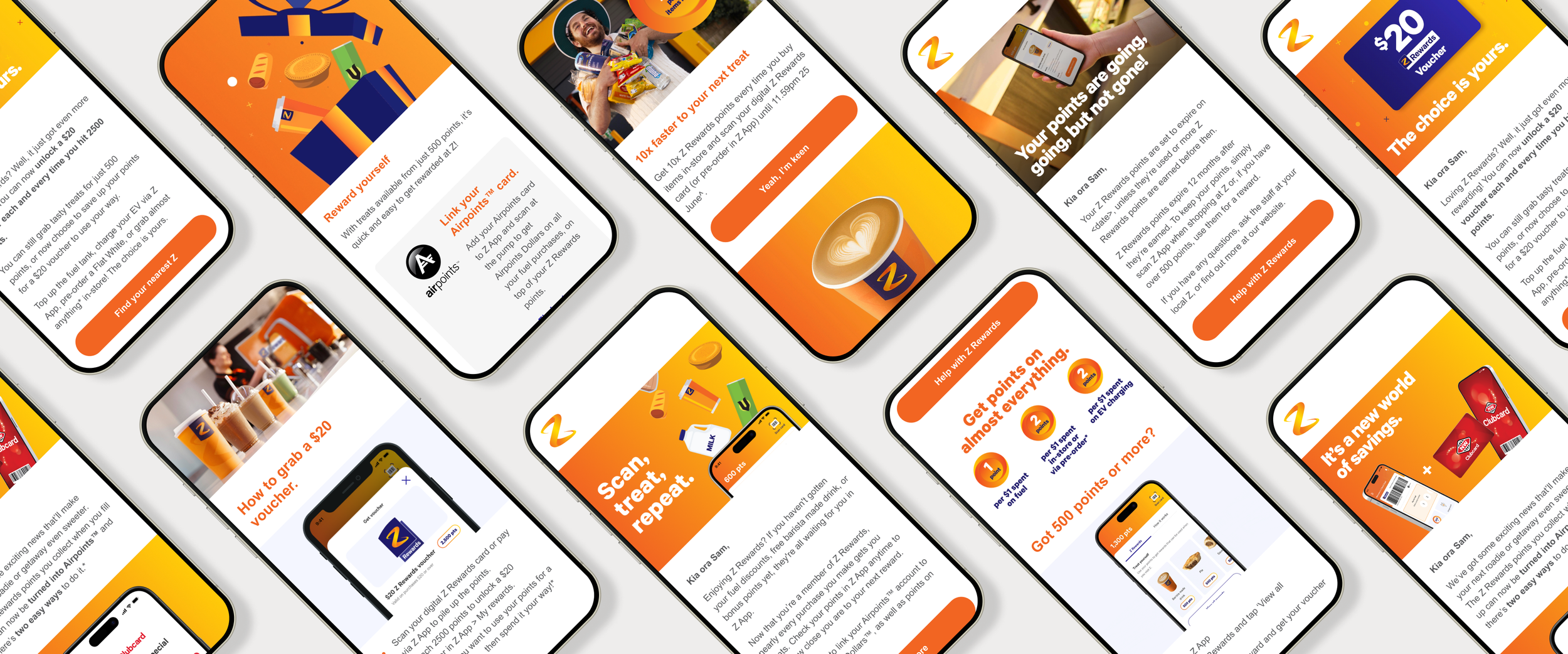
Launch emails
With Z Rewards came the need for a series of email journeys – beginning pre-launch and continuing beyond – to help customers join and understand the new programme. We spent six months planning and building these journeys ahead of the March 2025 launch.
Z Energy’s existing SFMC email templates were no longer fit for purpose, so we were tasked with creating a new system that felt more modern and considered, while also acting as a scalable foundation for all future consumer email communications.
Design focuses
Accessibility
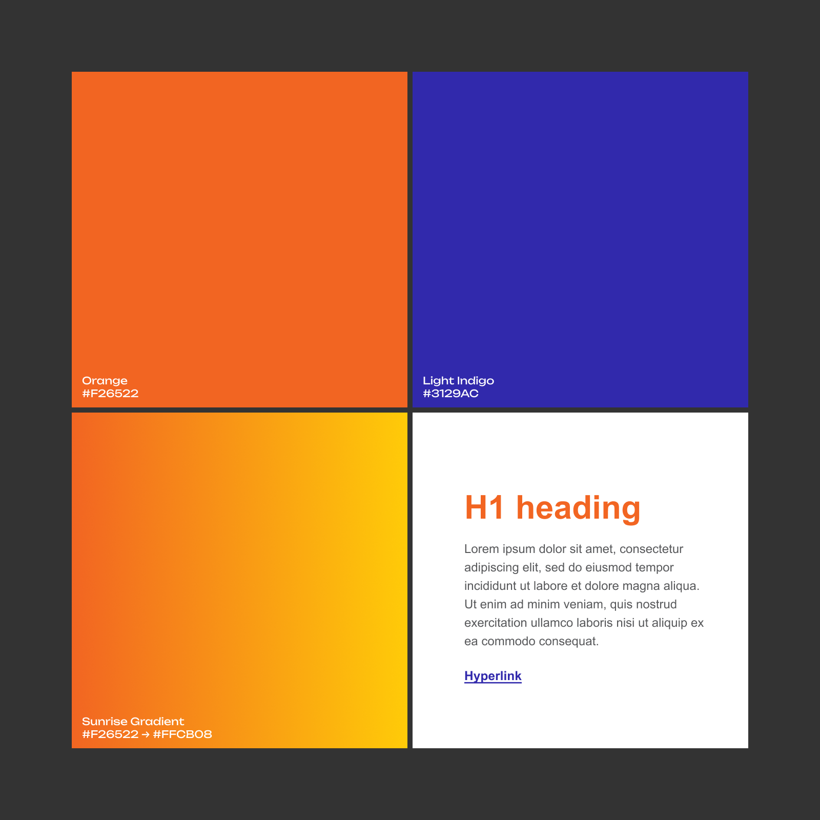
Accessibility was a key focus from the outset. While Z Energy’s brand guidelines are visually distinctive, some colour combinations didn’t meet digital accessibility standards. We tested these thoroughly and presented clear recommendations to the client.
This resulted in Z’s brand orange being reserved for larger text only, requiring an alternative for smaller elements such as hyperlinks. Indigo was introduced for this purpose. As Z’s marketing assets already make strong use of orange and yellow, the template itself was designed to remain largely neutral, allowing content to stand out without compromising accessibility.
Flexibility
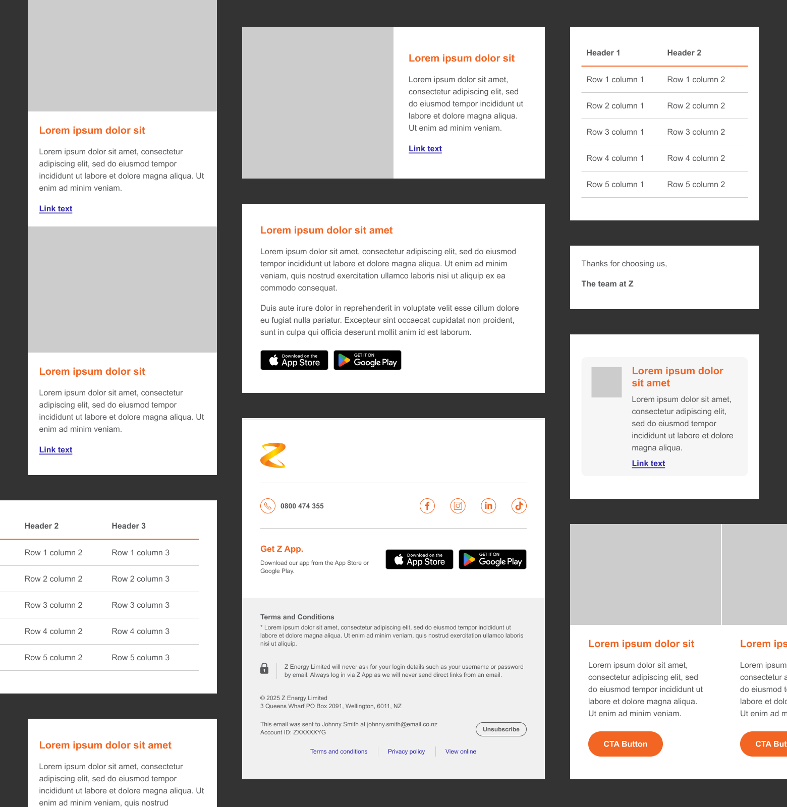
With many future use-cases in mind, flexibility was important. The template needed to support a variety of layouts and content types without requiring constant redesign or extra coding.
We developed more than 20 core components with multiple variations, resulting in over 120 modular options across desktop and mobile. These components used a mix of full-width and split layouts, giving designers the freedom to build emails that feel unique while still remaining consistent to others.
Design and build for the component library were developed in parallel across Figma and SFMC, ensuring what the client now sees in design can be accurately translated into final email outputs.
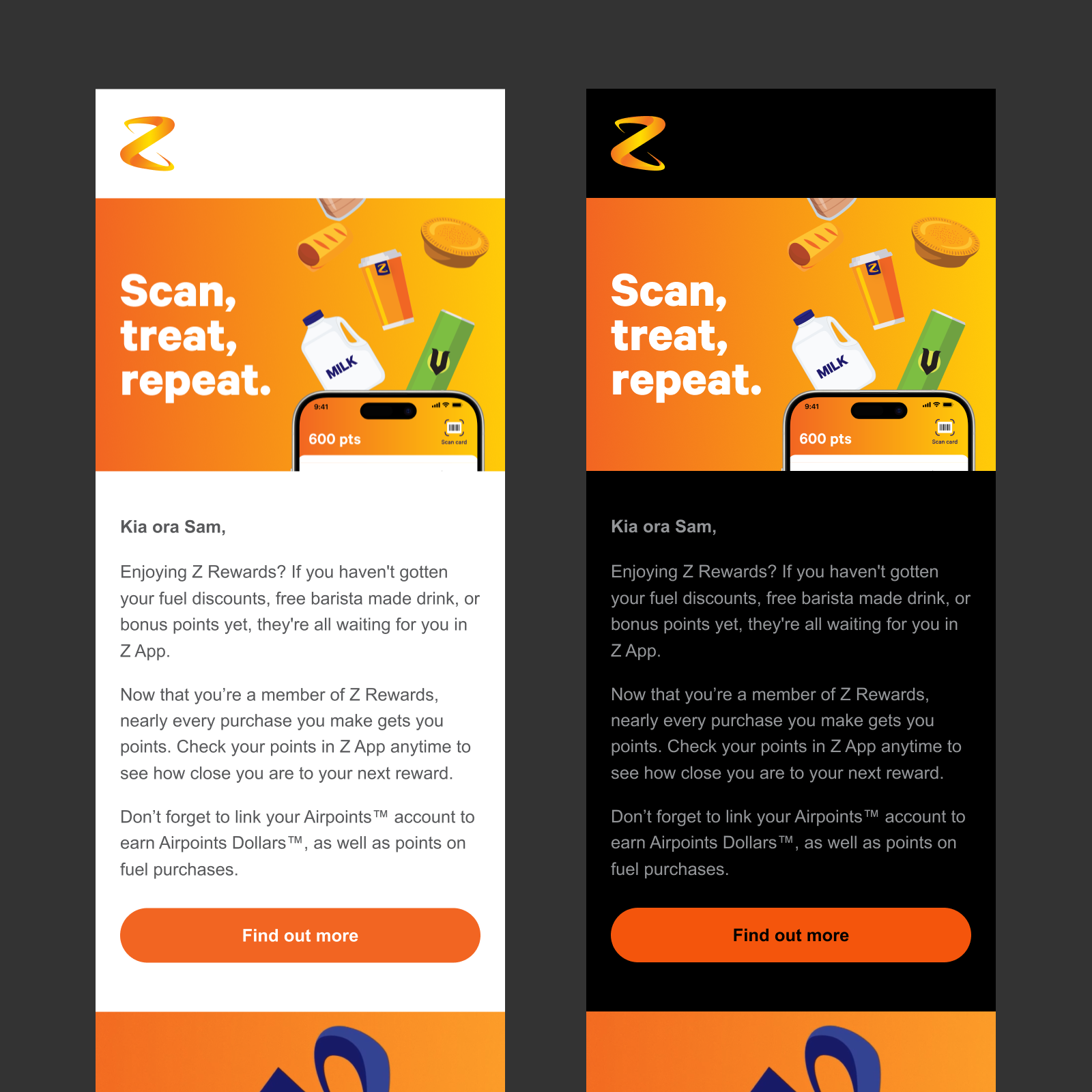
Made for dark mode
Dark mode was an important consideration throughout the project. With inconsistent dark mode behaviour across email clients, we tested extensively during the design phase to understand how colours and components would adapt.
While Z’s brand orange remained close enough, colours like indigo changed significantly. This reinforced the decision to keep coded elements largely neutral, with minor use of colour for emphasis. Indigo hyperlinks transitioned to a lilac tone in dark mode, which required alignment with Z’s internal brand team.
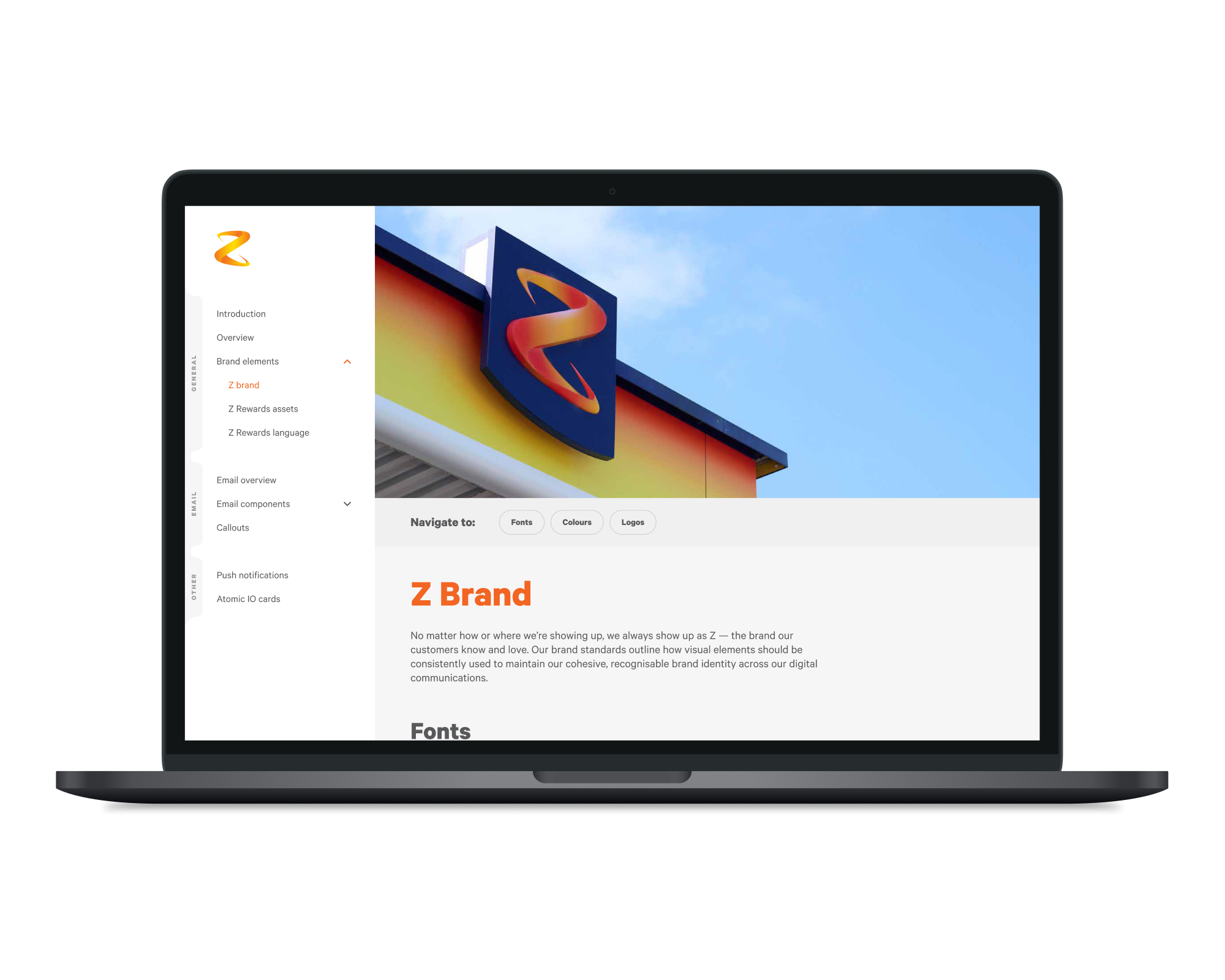
The Z Rewards Playbook
To support the rollout of Z Rewards and ensure consistency across teams, we created a comprehensive playbook within Figma. Designed to function like a lightweight brand guidelines site, it gave both Z stakeholders and external agencies a single source for programme rules and assets – collecting everything in one place.
The playbook featured a fully interactive nav allowing users to quickly find what they needed – from SFMC component libraries and layout guidance to tone of voice and push notification rules. By structuring the file in a way that was familiar and easy to explore, we made it simple to design, build and deliver communications that were aligned with the Z Rewards system.